Exploring Spike Sorting with PCA - An Approach to Neuronal Waveform Analysis
In this post, our aim is to get familiar with principal component analysis (pca) which is used for dimensionality reduction while also exploring an application of this technique for spike-sorting neuronal waveforms. We build our own primitive spike sorter using pca to analyze extracellular data from recordings in the primary motor cortex of a macaque monkey.
Introduction
There are many great resources on principal component analysis, but for the sake of completeness, here is a little intuition/explanation. It is a useful technique when dealing with large datasets. It basically is a projection of a higher-dimensional space into a lower dimensional one while preserving as much information as possible. In some fields, collected data can have dimensions on the thousands scale and manipulating the data in this way is not desirable for multitude of reasons - such as large computing time or storage problems. However the solution to these problems could not be just to arbitrarily ignore dimensions either, as we might lose some of the information we are trying to capture. Principal component analysis is a common method used to manage this trade-off. The idea is that we can select the ’most important’ dimensions, and keep those, while throwing away the ones that contribute mostly as noise.
Reducing the dimension does not mean that we throw away one of the correlated dimensions and keep the other. It is important to note that the dimension(s) chosen was not one of the original ones: in general, it won’t be, because that would mean our variables were uncorrelated to begin with. We can also see that the direction of the principal component is the one that maximizes the variance of the projected data. This means that we are keeping as much information as possible. So in that sense, principal component analysis is just a coordinate transformation.
Principal component is the dimension that maximizes the variance of the projected data.
The Data
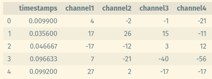
The data is an extracellular data recorded with intracortical electrodes from the primary motor cortex of a macaque monkey, and it contains waveforms and time stamps - waveforms in millivolts and timestamps in milliseconds 1. As seen below, it contains columns for each channel for all 48 channels, and a column for timestamps (although initially the timestamps column was not appended in the same file, but it was separate).
Outline
The data contains waveforms from 2 different days. We will first apply PCA to the first day’s waveform and see how many principal components explain the data and how much of the variance they explain. We will then choose the first 2 components and plot the waveforms in the PCA space, yielding the transformed data. Then form a template waveform by selecting a circular region inside the 2 clusters and compare the second day’s waveform with this template and its own template.
First Day’s Waveform
Let’s start by loading the waveform data, then using pca command of MATLAB on the first day’s waveforms.
1
2
3
4
5
6
7
8
load("SpikeSorting.mat");

wf1 = session(1).wf;
wf2 = session(2).wf;
stamps1 = session(1).stamps;
stamps2 = session(2).stamps;

[coeff, score, latent] = pca(double(wf1)); % LATENT contains eigenvectors
This command also creates the covariance matrix from the raw data so we can directly give it the waveform data. A variable I have called latent - that is returned from the pca command - contains variances, which can also be described as eigenvalues of the covariance matrix.
While taking progressively more principal components, we can calculate the total varience explained.
1
2
3
4
5
6
7
8
9
10
11
12
13
14
%% Plot Varience Explained
z = [0];
a = latent/sum(latent);
for i = 1:47
	temp = z(i) + a(i);
	z = [z temp];
end

figure()
plot(z, 'k--')
hold on
scatter(1:48, z, 'black')
xlabel('Dimensions Taken')
ylabel('Percentage of Variation Explained')
In figure 1, we can see the percentage of the variance explained by taking more and more principal components. Note that pca command also sorts the eigenvectors and values in a descending order so for example the first principal axis explains the most variance, while second one explains the second most variance in the data.
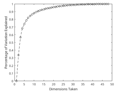 Figure 1: Visualization of how much variability of the data is represented as we take more and more principal components. Small number of dimensions can represent a huge number of variability in our data - i.e. taking 2 principal components cover 56 percent of the total variability.
Numerically, first principal component explains 0.3354 percent variance while second one contains 0.2317 percent of the total variance. Thus taking first 2 principal components would together explain 56.71 percent of the total variance, and taking the first 3 would explain 68.42 percent variance. As we take more and more components in the PC space, we explain more and more variability in the data. But we also increase the dimensions that we work with. Because of that, we may want to limit the number of axes we take from PC space. Here I have worked with the first 2 principal components of the PC space for the scope of this post.
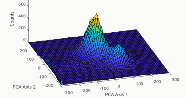
Let’s visualize by plotting the data in the PC space as a 3D histogram to inspect visually to decide on clusters that can represent our data, as can be seen in figure 2.
1
2
3
4
5
6
7
8
9
10
11
12
%% Histogram of PCA space
edges{1} = [-300:10:300];
edges{2} = [-250:10:250];

figure()
h = hist3(score(:,1:2), edges);
s = surface(h');
set(s,'XData',edges{1})
set(s,'YData',edges{2})
xlabel('PCA Axis 1')
ylabel('PCA Axis 2')
zlabel('Counts')
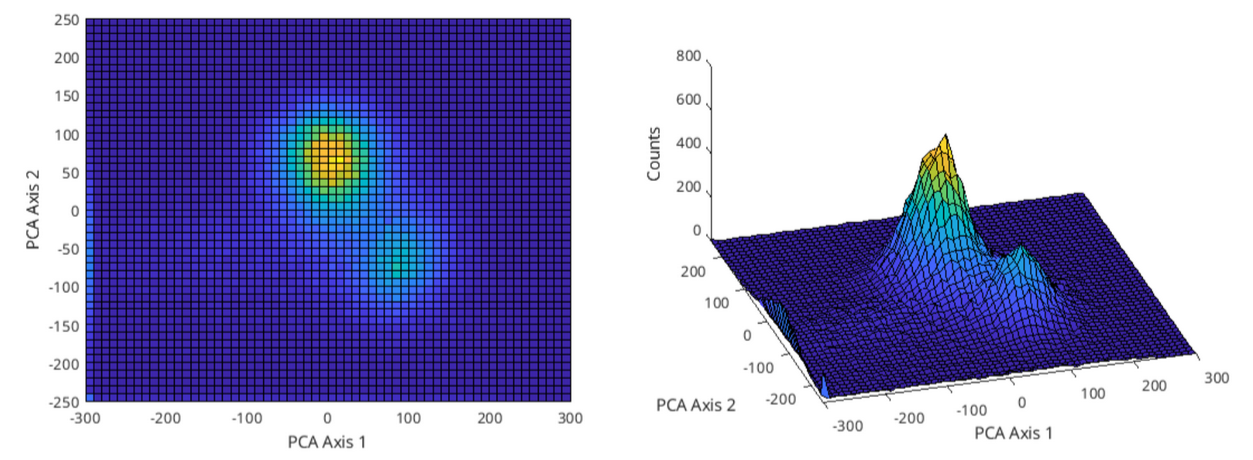 Figure 2: First day’s waveform data plotted in the PC space, taking the first 2 principal components only.
On figure 2, on the left we can see the ‘bird-eye view’ of the PC space and on the right is an angle of the 3D view of the same space. There seems to be 2 clusters that can be separated from each other manually; one with a center of roughly (12.5, 75) and a radius of 65, and the other with a center of (87.5, -67.5) and a radius of 37.5. Figure 3 shows these clusters marked with a circle with these values.
Here I have manually decided on the clusters; more professionally, this could be done programmatically, i.e. by choosing the full-width half-maximum value (or many other ways can be suggested of course).
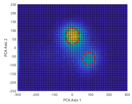 Figure 3: First 2 PC space clusters marked with red circles.
We can use these values to find the data that falls within the circles in PC space to get a template waveform. After the clusters are marked, in order to form a template waveform, I find the points - separately - that are inside both of those circles. Then, for all points that are in those circles, by multiplying with the transpose of the rotation matrix, we go back to the initial space/coordinates and average out across all channels. This way, we create an average template to distinguish the first neuron’s firings. Figure 4 shows the template for both of the clusters.
1
2
3
4
5
6
7
8
9
10
11
12
13
14
15
16
17
18
19
20
21
22
23
24
%% Find and Plot templates
centre1 = [12.5 75]; radius1 = 65; centre1_points = [];
centre2 = [87.5 -67.5]; radius2 = 37.5; centre2_points = [];

imp = score(:,1:2);
for i = 1:length(imp)
	% with norm, we calculate euclidean distance
	if norm(imp(i,:) - centre1) < radius1
		centre1_points = [centre1_points; score(i,:)];
	elseif norm(imp(i,:) - centre2) < radius2
		centre2_points = [centre2_points; score(i,:)];
	end
end

points = centre1_points * transpose(coeff);
points2 = centre2_points * transpose(coeff);

figure()
plot(mean(points,1))
hold on
plot(mean(points2,1))
grid on
xlabel('Channel Number')
ylabel('Mean Voltage (mV)')
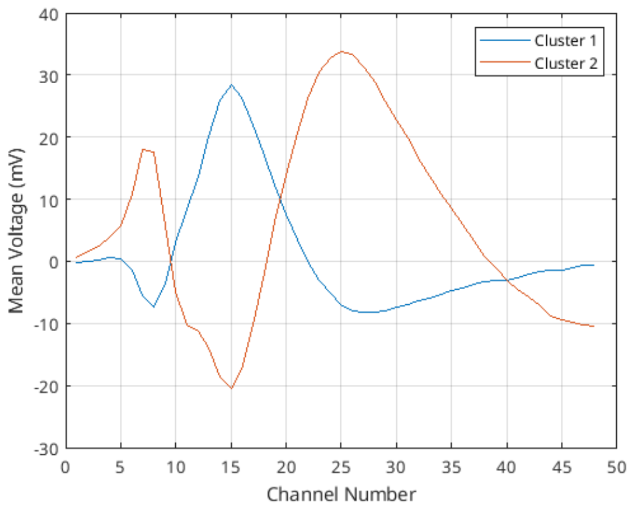 Figure 4: Template waveforms for both of the clusters found in the PC space.
What can be understood from figure 4 at a first glance is that these 2 neurons are measured in different amplitudes in different channels. Then the templates are a way to decide which of the neurons has fired. One way to achieve that information is to use RMSE (root mean squared error), where for a given waveform (or measurement), we can calculate the RMSE for all of the points of those clusters and see how they vary. Then, we could take their $mean + 2\cdot std$ for example, to decide whether a given waveform is from that cluster or not (of course this would mean that the neuron related to that cluster has fired).
1
2
3
%% RMSE
centre1_rmse = rmse(double(centre1_points), mean(points,1), 2);
wf1_rmse = rmse(double(wf1), mean(points,1), 2);
For cluster 1, mean RMSE is calculated to be 14.21 with a standard deviation of 3.27. For cluster 2, mean RMSE is 13.70 with a standard deviation of 4.32.
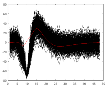 Figure 5: All waveforms plotted in black and the template plotted in red for the first cluster.
If we were to take $mean + 2\sigma = 20.75$ as the maximum RMSE value for the first cluster’s template (that is, if a waveform’s RMSE value compared to this template exceeds this value, we say its not from this cluster, or its not neuron 1), we can cover around 95.4% of the true firings of neuron 1 (assuming a normal distribution). For the second cluster, same value is calculated as 22.34. These values are calculated by taking RMSE for every waveform inside its own cluster with respect to the template waveform. In figure 5, we see the template created from the PC space and all of the waveforms that have lower RMSE (with respect to this template) than 20.75 (first cluster’s maximum RMSE value).
Second Day’s Waveform
We can now take the waveform data and compare it with the first day’s data to see if they are the same neurons or if there are any changes. The code from here on is the same, only applied to day 2 data, thus I am skipping most of the code and showing the results directly. Here we compare the projection of the second day’s data to the first day’s PC space, with the second day’s own PC space. What does the projection of the second day’s data onto the first day’s PC mean? It means to multiply coeff variable with the second day’s data in order to project it onto the PC space created for the first day’s data.
1
2
%% Day 2 Projection
proj_wf2 = double(wf2)*coeff;
To begin with, figure 6 shows the PC space of second day’s waveform data. Compared to the figure 2, this already looks different, as the clusters are not in the same locations. Moreover, there seems to be a change present in the counts, which indicate either less waveforms are captured by the clusters or waveforms are more spread across the cluster, making the cluster’s radius bigger. Further analysis can show which is true.
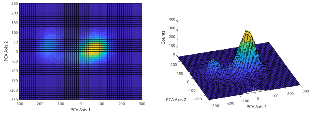 Figure 6: Second day’s waveform data plotted in the PC space, taking the first 2 principal components only.
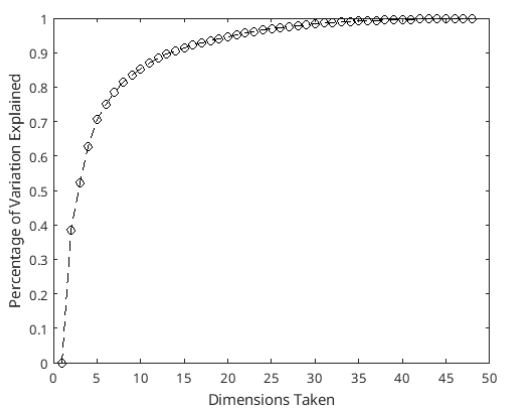 Figure 7: Percentage explained by principal components for day 2 waveform data’s PCA.
The first 2 principal components of the day 2 analysis can explain 52.29% of the variance in the data, as can be seen in figure 7.
Following the same steps, I first mark the clusters and determine center position and radius for both of them. There appears to be 2 clusters present again, which is expected, one with center position (60 10) and radius 30 and the other with center position (-160 30) and radius again 30. Note again that these are determined by examining visually and a programmatic approach would be better for professional use.
After marking these clusters, I again find all the waveforms that lie inside these clusters and plot their average to form the template waveform for both of them. Then, using the projection data, I find the template there with the first day’s own center and radius. Figure 8 shows 2 cluster’s difference between the projected data and its own PCA.
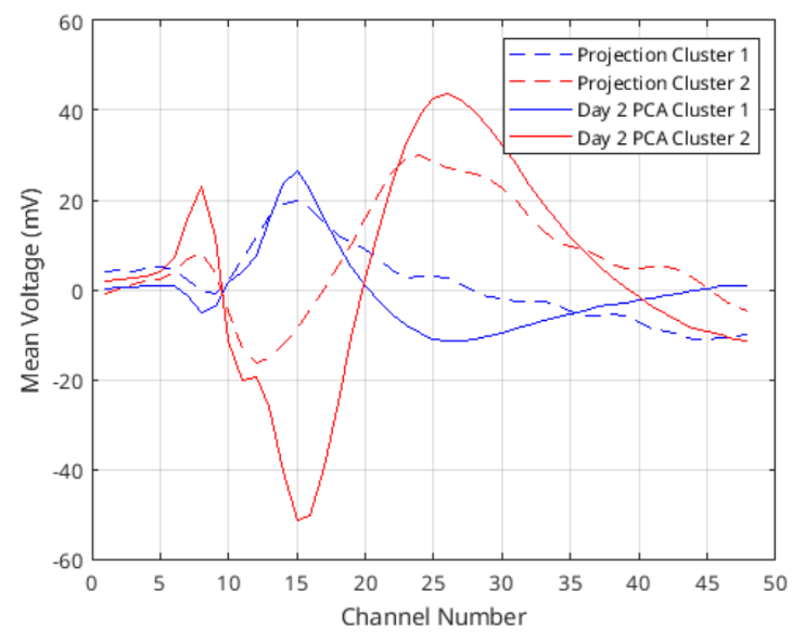 Figure 8: Template waveforms calculated for projection of day 2 onto day 1 PC space and day 2 data’s own PCA.
Even though they do not lie perfectly on top of each other, their shapes do look similar. In fact, comparing the projected cluster 1 template with day 2 PCA cluster 1 template by using RMSE gives 7.31, which is below the thresholds for any waveform calculated before. RMSE between cluster 2 lines is 9.04 which is still quite low. We can conclude that these are the same neurons, but there may be a distortion happening in the data that effects the shapes of the templates.
This change in the data may be because of changes in the electrode location or structure. It is best to recalibrate the equipments that work with implanted electrodes regularly to account for these changes.
References
- Matlab for Neuroscientists. (2009). Elsevier. https://doi.org/10.1016/b978-0-12-374551-4.x0001-2
- Ethem Alpaydin. 2010. Introduction to Machine Learning (2nd. ed.). The MIT Press.
This topic is explored more deeply in the book Matlab for Neuroscientists, I strongly encourage for anyone interested to look into. The data is provided by the author too, but also mentioned that it is courtesy of the Hatsopoulos laboratory. ↩
