Central Limit Theorem — An Experimental Proof
In this story, I briefly introduce what is central limit theorem and provide a visual proof using python to generate data and plot its distribution.
Central Limit Theorem
Central limit theorem states that irrespective of the distribution of the data in the original population, the sample means will demonstrate a normal distribution (Bell shaped curve).
That tells us that whatever the distribution/shape of the population/original data; when we take samples with a sufficient sample size and take their means, resulting distribution (of said means) is always normal.
This theorem also states that the mean value of all possible sample means will be equal to the original population mean. Also each sample must be chosen randomly where each value have the same probability of being chosen.
Lastly, as sample size gets larger, central limit theorem is more valid. That means if we were to only take 3 samples from a population to calculate means, sample means distribution is likely to look like the population distribution. Though as the sample size gets bigger, for ex. 50, sample means start to resemble more of a bell shape.
Implementation from Scratch
Imports:
1
2
3
import numpy as np
import matplotlib.pyplot as plt
import seaborn as sns
Starting with normal distribution
Of course we expect a normal distribution’s sample means to be shaped normal. Though it is a good practice to have a control method for comparing skewed distributions later.
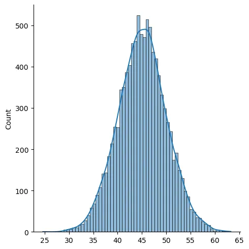
Let us generate the data. For a normal distribution, we will use a mean value, mu, and a standard deviation value sigma. Below I choose these values randomly as 45 and 5 respectively and plot the resulting distribution for 10000 values.
Seaborn library helps us create distribution plots with ease.
1
2
3
4
mu, sigma = 45, 5
X = np.random.normal(mu, sigma, 10000)

sns.displot(X, kde = True)
Now we want to take randomly selected values from this dataset to create our sample and for each ‘sample-set’, we are going to calculate a mean value. We will have as much mean values as our sample sets which will give us a new distribution when plotted. We expect this resulting distribution to be normal.
1
2
3
4
5
sample_means = []
for _ in range(500):
    sample_means.append(np.random.choice(X, 20, replace = True).mean())

sns.displot(sample_means, kde = True, bins=50)
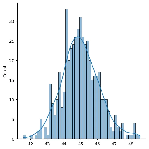
So far so good, resulting distribution really is a bell-shaped one. Now let us take a look at the same procedure with a skewed distribution.
Skewed distribution sample means
In order to create a skewed distribution, I will make use of scipy library’s method called skewnorm.rvs. This method has a parameter for skewness which can be seen below as ‘a’.
1
2
3
4
5
6
from scipy.stats import skewnorm

a=10
data= skewnorm.rvs(a, size=10000)

sns.displot(data, kde = True)
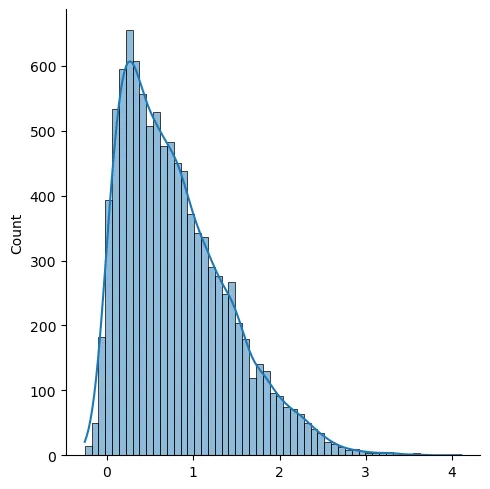
As we can see, this time our data is skewed. I have used a positive value for skewness and resulting distribution is referred to as a positive skewness or right-skewed. The peak of this distribution is the mode.
Again if we take samples from this skewed dataset, take their means and plot them, we now -knowing about the central limit theorem- expect the distribution of those means to be normal. Let us see if that is the case.
1
2
3
4
5
6
sample_means = []
for _ in range(500):
    sample = np.random.choice(data, 20, replace = True)
    sample_means.append(sample.mean())

sns.displot(sample_means, kde = True, bins=50)
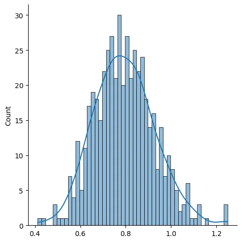
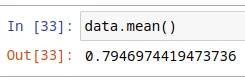
It really looks like a normal distribution. Also let me point out that the sample means distribution peak is at around 0.8 which is the original population’s mean. We can also show that as follows.
Sample means distribution for various skewed datasets
We can create an animation to see whether different skewness or sample size values have an effect on central limit theorem. Let us begin by creating some methods to easily use the codes above.
1
2
3
4
5
6
def generate_skewed_dist(a = 10, size = 100000, plot = False):
    from scipy.stats import skewnorm
    data = skewnorm.rvs(a, size = size)

    if plot: sns.displot(data, kde = True)
    return data
Note that a=0 creates a nomal distribution, while other values result in a skewed one.
1
2
3
4
5
6
7
8
def sample_means(data, sample_size = 20, plot = False):
    sample_means = []
    for _ in range(int(np.floor(len(data)/sample_size))):
        sample = np.random.choice(data, sample_size, replace = True)
        sample_means.append(sample.mean())

    if plot: sns.displot(sample_means, kde = True, bins=50)
    return sample_means
Now with these methods created, let us take a range of ‘a’ values to change skewness. In the following code, this change is done inside the animate function which is called by matplotlib every frame.
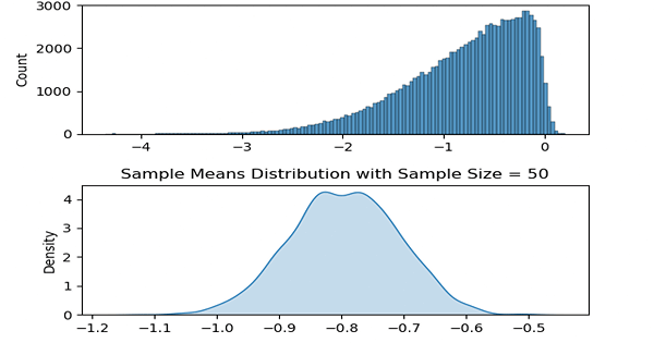
Two plots are created each frame where the above one is the plot of the population distribution and the below one is its sample means distribution.
1
2
3
4
5
6
7
8
9
10
11
12
13
14
15
16
17
18
19
20
21
22
23
24
25
26
27
28
import matplotlib.animation as anim

a_values = list(range(-16, 17, 2))
sample_size = 50

data = generate_skewed_dist()
means = sample_means(data, sample_size = sample_size)

def animate(i):
    ax1.clear()
    ax2.clear()

    ax1.set_title('Population Distribution')
    ax2.set_title('Sample Means Distribution with Sample Size = ' + str(sample_size))

    data = generate_skewed_dist(a_values[i])
    graph = sns.histplot(data, ax = ax1)

    means = sample_means(data, sample_size = sample_size)
    graph = sns.kdeplot(means, fill = True, ax = ax2)

fig, (ax1, ax2) = plt.subplots(nrows=2, ncols=1)
plt.subplots_adjust(wspace = 0.4,
                    hspace = 0.4)

ani = anim.FuncAnimation(fig, animate, frames=len(a_values),
                         interval=200, repeat=True)
ani.save('clt_anim.gif')
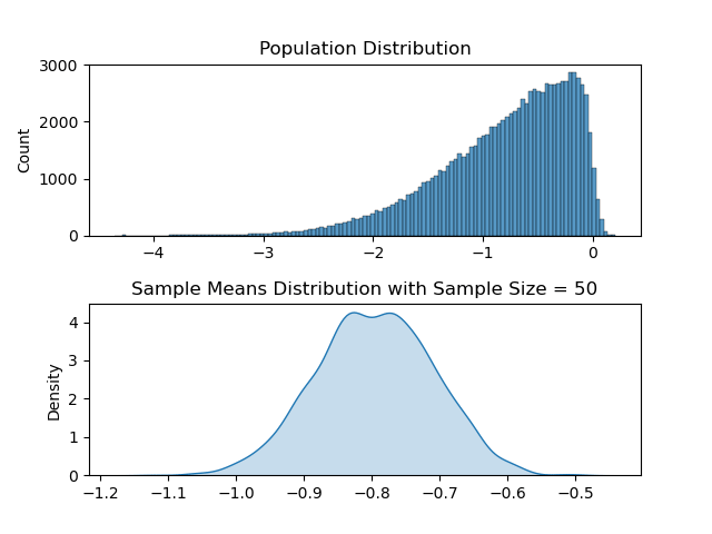
As it may be apparent, for each of the ‘differently skewed’ distributions, sample means plot looks like a bell shaped one and is a normal distribution. Also its mean value follows the population’s mean value.
Comparing with a lower sample size
Let us take a really small sample size, something like sample size = 3. In this case what we can expect from sample means distribution is to follow its ‘ancestor’ (population), and be more skewed. I will use the same code above and only change the sample_size parameter to 3. Resulting animation is as below.
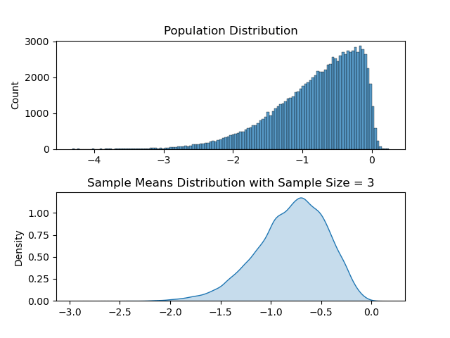
It may be subtle, but the sample means distribution and the population distribution does look more alike. So this shows us greater sample size is required in order for central limit theorem to be relevant.
References
- Glantz S. A. (1987). Primer of biostatistics (7th ed.). McGraw-Hill.